

Picking the Right Kind of Chart
Charts are great for telling stories, and software like Excel makes them easy to create. What’s hard is making sure they paint the picture you want. A good place to start is by using the type of chart that emphasizes what you consider most critical.
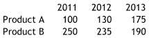
To see how different charts can shift the focus, let’s compare sales of two products. The numbers are at the right — notice that sales of Product A are increasing while those of B decline.
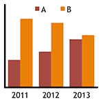
Column Charts Compare Amounts. First let’s see how two different column charts show the same data. The chart on top makes it easy to see how Product B outsold A each year; the one on the bottom that A’s sales are increasing while B’s decline. What’s different is how the columns are grouped: by year on top; by product on the bottom.
These groups are usually called "categories." Something that is measured from category to category, such as sales of Product A on top, is called a "series." Charting software lets you specify how information is organized into categories and series.
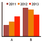
Stacked Column Charts Show Totals and Their Components. What neither column chart shows is a category’s total sales. We could create a separate chart for this, but then the reader would have to look in two places for the whole story. A better solution is to stack individual columns on top of each other so their combined height shows the total. The results here are revealing — total sales have been flat.
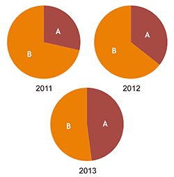
Pie Charts Show Portions. This stacked column chart also shows how A’s share of total sales has been increasing. But the trend would not be as apparent if total sales had changed more from year to year. That is why pie charts are often used to emphasize percent comparisons.
Here they show that Product A’s share has grown from little more than a quarter in 2011 to nearly half in 2013. Since all three pies are the same size, it is easy to compare the relative size of the slices.
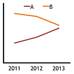
Line Charts Show Trends. Finally there are times when you want to emphasize trends. Often the simplest way is with a line chart. Here we see sales of Product A going up while those of B decline, just as we did in the column chart grouped by year. What the line chart shows that the column chart does not is that the lines are converging and will cross if the trend continues.
* * * * *
They say a picture is worth a thousand words. Charts are simply pictures of data and can show the same information from different perspectives. Make sure you pick the one that conveys the message you intend.
Charts are covered in our Mastering Excel and Excel Charts classes.
Visit our Excel Productivity Guides page for more helpful articles.
This article originally appeared in our free twice-monthly e-mail newsletter. To receive future issues, please add your name to the subscription list.
Free NewsletterWant to learn more? We offer seven different Excel classes: Mastering Excel, Advanced Excel, Excel Charts, Excel Dashboards, Macros and Pivot Tables and Power Pivot. Click any class name for a detailed description.
Class ScheduleWe can also create a private Personalized Excel Class for your group, or provide individual training or project consulting services.